Hero Sections
To be used if this page is part of a series
Hero Section
To be used as the first section for a page. There should be no more than 1 hero section per page. Elements in this section: Header, Paragraph, Lists, Button
Remove the list if not needed
Estimate Price
To be used if this page is part of a series
Hero Section With Form
To be used as the first section for a page. There should be no more than 1 hero section per page. Elements in this section: Header, Paragraph, Lists, Button
Begin Inquiry
With bottom bar of buttons
Hero Section
To be used as the first section for a page. There should be no more than 1 hero section per page. Elements in this section: Header, Paragraph, Lists, Button
Layout Grids
Centered Title h2
Centered title marks the beginning of a new major section.
Blank Section: no grid at all.
Sub header should be expanding on the main idea , delete if not needed
Blank Section is used to host anything that does not require special layout. Elements in this section: Header, Paragraph, Table, Button.
| Cell Name | Location |
|---|---|
| Some Cell Value Here | Bone |
| Other Cell Value Here | Throat |
| One Last Cell Value | Really Long Location Value Here |
2 Columns With Image
Sub header should be expanding on the main idea , delete if not needed
2 Column with Image can be used to feature a concept with image and text, and offer some interactive elements such as plain links or button(s).
Remove list if not needed
2 Columns With Card
Sub header should be expanding on the main idea , delete if not needed
2 Column with Image can be used to feature a concept with image and text, and offer some interactive elements such as plain links or button(s).
Remove list if not needed
Full Width Background Card
Lorem ipsum dolor sit amet, consectetur adipisicing elit, sed do eiusmod tempor incididunt ut labore et dolore magna aliqua. Ut enim ad minim veniam, quis nostrud exercitation ullamco laboris nisi ut aliquip ex ea commodo consequat. Duis aute irure dolor in reprehenderit in voluptate velit esse cillum dolore eu fugiat nulla pariatur. Excepteur sint occaecat cupidatat non proident, sunt in culpa qui officia deserunt mollit anim id est laborum.
1:1 Columns
Sub header should be expanding on the main idea , delete if not needed
2 columns with the same width. Can be used to feature plain contents. Elements included in this section: Header, Paragraphc, Table, Lists, Button. Remove any elements if not needed.
Remove button if not needed1:1:1 Columns
3-5 columns with the same width. Can be used to feature plain contents. Elements included in this section: Header, Paragraphc, Table, Lists, Button. Remove any elements if not needed. 3-5 columns with the same width. Can be used to feature plain contents. Elements included in this section: Header, Paragraphc, Table, Lists, Button. Remove any elements if not needed.
Remove button if not needed3-5 columns with the same width. Can be used to feature plain contents. Elements included in this section: Header, Paragraphc, Table, Lists, Button. Remove any elements if not needed.
Remove button if not needed3-5 columns with the same width. Can be used to feature plain contents. Elements included in this section: Header, Paragraphc, Table, Lists, Button. Remove any elements if not needed.
Remove button if not neededTabs
Price Calculator
Settings
Generate!
Calculator HTML
Placeholder Title Calculator
Form Elements
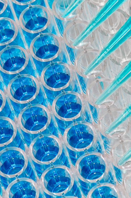
Free Quote for Western blot services
Call to Action
Did You Know ?
You can Save up to 90% on the above regerent if you buy them from Bosterbio
Did You Know ?
You can Save up to 90% on the above regerent if you buy them from Bosterbio
Credibility Section
PhD-level support
great communication
Experience
since 1993
30,000+
publications
Proprietary
technologies
40,000+
antibodies made
Card Deck
RELATED Bioanalytical SERVICES
Cell-based assays, immunoassays, ELISA, pathology, molecular biology, qPCR.

-
Immunohistochemistry and immunofluorescence services
See details -
Cell potency assay and compound screening, hit to lead
See details -
ELISA services
See details -
Multiplex ELISA Services
See details -

qPCR services
See details
Testimonials

Maria Teresa Dell'Anno
Postdoc
This Antibody Works Perfectly!
I used it for IHC on frozen sections at a dilution of 1:500. It did not need several trials to optimize the protocol. No bad things overall. I will purchase it again.
I used it for IHC on frozen sections at a dilution of 1:500. It did not need several trials to optimize the protocol. No bad things overall. I will purchase it again.
I used it for IHC on frozen sections at a dilution of 1:500. It did not need several trials to optimize the protocol. No bad things overall. I will purchase it again.
I used it for IHC on frozen sections at a dilution of 1:500. It did not need several trials to optimize the protocol. No bad things overall. I will purchase it again.
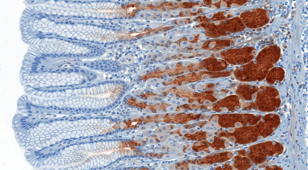
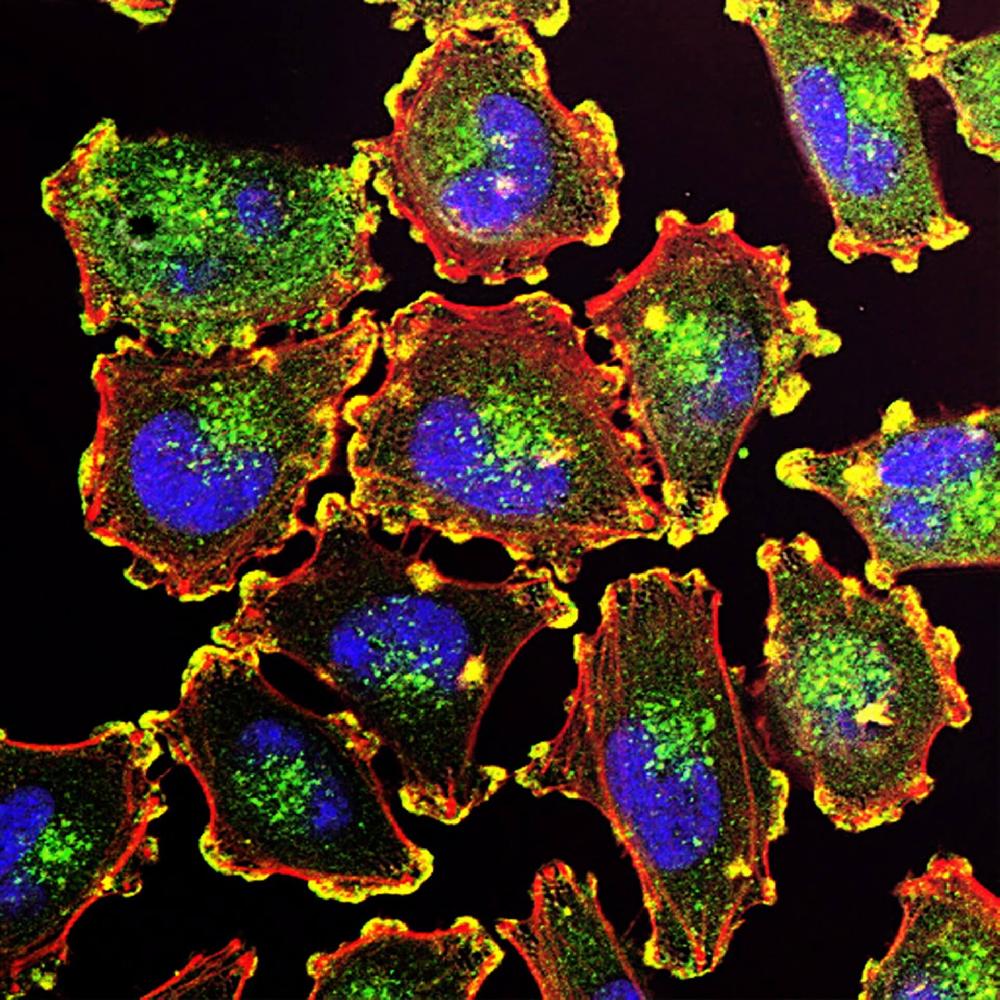
Immunohistochemistry , Spinal cord , Confocal microscope
Maria Teresa Dell'Anno
Postdoc
This Antibody Works Perfectly!
I used it for IHC on frozen sections at a dilution of 1:500. It did not need several trials to optimize the protocol. No bad things overall. I will purchase it again.
Immunohistochemistry , Spinal cord , Confocal microscope
Maria Teresa Dell'Anno
Postdoc
This Antibody Works Perfectly!
I used it for IHC on frozen sections at a dilution of 1:500. It did not need several trials to optimize the protocol. No bad things overall. I will purchase it again.
Immunohistochemistry , Spinal cord , Confocal microscope
Maps & Workflow
A Stepwise Workflow
This is used for listing out steps with brief description. Each row can accommodate one short paragraph and no other elements.
Logo Parade
Logo parade will be used for important pages such as product/service offers and about us. It should not be used on content or listing pages. Only one logo parade can be used on a page due to Js limitations.
Partners & Customers
Accordions
Accordions
Can be used for listing lots of complex info, like FAQs or additional services on service offer pages
Q1. What is ELISA Kits ?
Q2. Some Other Question ?
Q3. One More Question Goes Here ?
Q3. One More Question Goes Here ?
Q3. One More Question Goes Here ?
Q3. One More Question Goes Here ?
FAQs
This component is specially made for FAQs with FAQ schema mark up. Make sure to use this for all Q&As and FAQs.
Q1. What is ELISA Kits ?
Q2. Some Other Question ?
Q3. One More Question Goes Here ?
Q3. One More Question Goes Here ?
Q3. One More Question Goes Here ?
Q3. One More Question Goes Here ?
Product Showcase
Product Showcase Heading
Lorem ipsum dolor sit amet
Products Here
| SKU | EK0540 |
|---|---|
| Reactivity | Rat |
| Applications | ELISA |
Product Title Here
| SKU | EK0540 |
|---|---|
| Reactivity | Rat |
| Applications | ELISA |
Product Title Here
| SKU | EK0540 |
|---|---|
| Reactivity | Rat |
| Applications | ELISA |
Products Here
| SKU | EK0540 |
|---|---|
| Reactivity | Rat |
| Applications | ELISA |
Product Title Here
| SKU | EK0540 |
|---|---|
| Reactivity | Rat |
| Applications | ELISA |
Product Title Here
| SKU | EK0540 |
|---|---|
| Reactivity | Rat |
| Applications | ELISA |
Product Showcase Heading
Lorem ipsum dolor sit amet
Style Guide
Colors
Brand Orange
#EA8D28
Brand Blue
#3CA9D6
Dark Grey
#434343
Medium Grey
#878787
Grey
#6d6d6d
Light Grey
#F2F2F2
Typography
Josefin Sans
Lorem ipsum dolor sit amet consectetur adipisicing elit. Doloribus quae quo minima voluptatibus aperiam nostrum repellat error earum aliquid dolore assumenda, repudiandae suscipit hic quod recusandae debitis cum ipsam deserunt.
Muli
Lorem ipsum dolor sit amet consectetur adipisicing elit. Doloribus quae quo minima voluptatibus aperiam nostrum repellat error earum aliquid dolore assumenda, repudiandae suscipit hic quod recusandae debitis cum ipsam deserunt.
Hierarchy
Tier One
The Tier One is the main content element of the page
Tier Two
The Tier Two is used to lead a major section of content
Tier Three
The Tier Three is used to lead a sub section of a major section
Tier Four
The Tier Four is used to lead a side content
Tier Five
The Tier Five is used to lead a sub content within a side content
Text Block Example
Boster Bio Provides High Quality ELISA Kits
we have been making ELISA Kits Since 1983
Lorem ipsum dolor sit amet consectetur, adipisicing elit. Ducimus fuga cupiditate velit, doloribus quasi vero, temporibus non, quis et ex rem consequatur quisquam iure culpa molestias accusantium alias asperiores ab. Non nostrum tempora voluptates culpa voluptas. Voluptatibus, veniam. Suscipit doloremque, optio molestias non dolor deserunt officiis repudiandae perferendis voluptate ullam?
Lorem ipsum dolor sit amet consectetur, adipisicing elit. Ducimus fuga cupiditate velit, doloribus quasi vero, temporibus non, quis et ex rem consequatur quisquam iure culpa molestias accusantium alias asperiores ab. Non nostrum tempora voluptates culpa voluptas. Voluptatibus, veniam. Suscipit doloremque, optio molestias non dolor deserunt officiis repudiandae perferendis voluptate ullam?
Contact Us Find Out MoreText Emphasising Options
This is an Important Text
This is an Important Text
This is an Important Text
This is an Important Text
Buttons
Tables
| Cell Name | Location |
|---|---|
| Some Cell Value Here | Bone |
| Other Cell Value Here | Throat |
| One Last Cell Value | Really Long Location Value Here |
| SKU: | PB90394 |
|---|---|
| Size: | 100µg/vial |
| Reactivity: | Human , Mouse , Rat |
| Host: | Rabbit |
| Applications: | Flow Cytometry , IHC,ICC,WB |
Icons
Science concept icons
Antibodies
Secondary Antibody
ELISA
Proteins
DNA molecule
Array of dots
Reagent kits
PCR Machine
Fluorophore
Western blotting
Histology/IHC
Substrate
Calculator
Animals / Species
Rabbit
Rat
Mouse
Goat
Zebrafish
C elegans
Virus
Cells
Combinantion icons
Rabbit Polyclonal
Mouse Monoclonal
Rabbit Monoclonal
Discountinued Antibodies
Cards
Text card
This card is good for featuring some textual contents in plain format. Usually such text should be rather long to make the height of the card close to or longer than its width. Lorem ipsum dolor sit amet, consectetur adipisicing elit, sed do eiusmod tempor incididunt ut labore et dolore magna aliqua. Ut enim ad minim veniam, quis nostrud exercitation ullamco laboris nisi ut aliquip ex eacommodo
Remove Button if not neededCard With Icon
This type of card is perfect to showcase sub topics or features , If the icon does not exist on the website, please include some reference here to tell the designer what the icon should be.
Remove Button if not neededCard With Image
If the image does not exist on the website, please include some reference here to tell the designer what the image should be.
Remove Button if not needed
Card With Expandable Menu
This card is good for hosting very complex information without looking too busy.
Hove me for usage instructions
Card That Shows More info
Use this card when you have a lot of information to show in minimum area , if you have a topic that is taking more than a full window's height worth of space, try to use this card to contain the contents within 1 window/page's height.
Delete the button if not requiredColors
The Color Scheme of the website and the usage of it . this text is absolutely dumb and should be discussed
Text Colors
The following classes are meant to be used on a text , they won't affect the actual background of the element
| Name | Class | Code | Color Info | Result |
|---|---|---|---|---|
| Orange | text-orange | <p class="text-orange">...</p> | #ea8d28 |
Orange Text |
| Blue | text-blue | <p class="text-blue">...</p> | #3ca9d6 |
Blue Text |
| Dark Grey | text-darkgrey | <p class="text-darkgrey">...</p> | #434343 |
Dark Grey Text |
| Medium Grey | text-midgrey | <p class="text-midgrey">...</p> | #878787 |
Medium Grey Text |
| Grey | text-grey | <p class="text-grey">...</p> | #6d6d6d |
Grey Text |
| Light Grey | text-lightgrey | <p class="text-lightgrey">...</p> | #f2f2f2 |
Light Grey Text |
| Danger | text-danger | <p class="text-danger">...</p> | #bf3535 |
Danger Text |
| Success | text-success | <p class="text-success">...</p> | #3cbf35 |
Success Text |
Background Colors
The following classes are meant to be used on a block , they won't affect the actual text color of the element
| Name | Class | Code | Result |
|---|---|---|---|
| Orange | bg-orange | <p class="bg-orange">...</p> |
Orange Background |
| Blue | bg-blue | <p class="bg-blue">...</p> |
Blue Background |
| Dark Grey | bg-darkgrey | <p class="bg-darkgrey">...</p> |
Dark Grey Background |
| Medium Grey | bg-midgrey | <p class="bg-midgrey">...</p> |
Medium Grey Background |
| Grey | bg-grey | <p class="bg-grey">...</p> |
Grey Background |
| Light Grey | bg-lightgrey | <p class="bg-lightgrey">...</p> |
Light Grey Background |
| Danger | bg-danger | <p class="bg-danger">...</p> |
Danger Background |
| Success | bg-success | <p class="bg-success">...</p> |
Success Background |
Cutoff
The cutoff mechanism is meant to display long content in a better way
The cutoff usage consists of two classes , .cutoff & .cutoff-point , the .cutoff is the parent element container and the .cutoff-point is where the content should be hidden
Code Smaple:<div class="cutoff">
...
<span class="cutoff-point"></span>
....
</div>
Example:
Important Usage Rules:
The .cutoff-point item should be a direct child of .cutoff element
Font Sizes
The following classes control the text sizing based on the predefined size classes
| Name | Class | Code | Result |
|---|---|---|---|
| Smaller | font-smaller | <p class="font-smaller">...</p> |
Smaller Size |
| Small | font-small | <p class="font-small">...</p> |
Small Size |
| medium | font-medium | <p class="font-medium">...</p> |
medium Size |
| Large | font-large | <p class="font-large">...</p> |
Large Size |
| Larger | font-larger | <p class="font-larger">...</p> |
Larger Size |
| Largest | font-largest | <p class="font-largest">...</p> |
Largest Size |
| Default h1 | none | <h1>...</h1> |
Heading |
| Default h2 | none | <h2>...</h2> |
Heading |
| Default h3 | none | <h3>...</h3> |
Heading |
| Default h4 | none | <h4>...</h4> |
Heading |
| Default h5 | none | <h5>...</h5> |
Heading |
| Default p | none | <p>...</p> |
Heading |
| Default Font Size | none | <p>...</p> |
Paragraph |
List Styles
The following classes control the list style based on the predefined size classes
| Name | Class | Code | Result |
|---|---|---|---|
| Numbers | list-style-numbers | <ol class="list-style-numbers">...</ol> |
|
| Roman | list-style-roman | <ol class="list-style-roman">...</ol> |
|
| Alphabetical | list-style-alpha | <ol class="list-style-alpha">...</ol> |
|
| Lower Case Alphabetical | list-style-alpha-lower | <ol class="list-style-alpha-lower">...</ol> |
|
| Greek | list-style-greek | <ol class="list-style-greek">...</ol> |
|
| Bullets | list-style-bullets | <ul class="list-style-bullets">...</ul> |
|
| Circles | list-style-circles | <ul class="list-style-circles">...</ul> |
|
| Squares | list-style-squares | <ul class="list-style-squares">...</ul> |
|
Text Alignment
The following classes control the text alignment
| Name | Class | Code | Result |
|---|---|---|---|
| Left (Default) | text-left | <p class="text-left">...</p> |
Left Aligned Text |
| Center | text-center | <p class="text-center">...</p> |
Center Aligned Text |
| Right | text-right | <p class="text-right">...</p> |
Right Aligned Text |
Items Alignment
The following classes control the items alignment on the screen , it's important to notice that all the content should be in a parent container.
Horizontal Center Alignment
No matter the width of the container or the elements , the element will always be in the center.
<div class="horizontal-center"><div>
<img src="/media/images/placeholder.jpg" alt="Alt" title="Title">
</div>
</div>
Result
Vertical Center Alignment
No matter the height of the container or the elements , the element will always be in the center.
<div class="vertical-center"><div>
<img src="/media/images/placeholder.jpg" alt="Alt" title="Title">
</div>
</div>
Result
Background Positions
The following classes control the position of an item with background-image property
| Name | Class | Code | Result |
|---|---|---|---|
| Top | background-top | <section class="background-top">...</section> |
Background Image Positioned Top |
| Right | background-right | <section class="background-right">...</section> |
Background Image Positioned Right |
| Bottom | background-bottom | <section class="background-bottom">...</section> |
Background Image Positioned Bottom |
| Left | background-left | <section class="background-left">...</section> |
Background Image Positioned Left |
Font Style
The following classes control the font style variations
| Name | Class | Code | Result |
|---|---|---|---|
| Uppercase | text-uppercase | <p class="text-uppercase">...</p> |
All Capital Case |
| Lowercase | text-lowercase | <p class="text-lowercase">...</p> |
All Lower case |
| Capitalize | text-capitalize | <p class="text-capitalize">...</p> |
text capitalized |
| Bold | font-weight-bold | <p class="font-weight-bold">...</p> |
Bolded Font |
| Italic | font-italic | <p class="font-italic">...</p> |
Italic Font |
Spacing
The following classes control the elements spacing
| Name | Class | Code | Result |
|---|---|---|---|
| Padding | p-0 | <p class="p-0">...</p> |
No Padding |
| Padding | p-1 | <p class="p-1">...</p> |
Padding 1 |
| Padding | p-2 | <p class="p-2">...</p> |
Padding 2 |
| Padding | p-3 | <p class="p-3">...</p> |
Padding 3 |
| Padding | p-4 | <p class="p-4">...</p> |
Padding 4 |
| Padding | p-5 | <p class="p-5">...</p> |
Padding 5 |
| Margin | m-0 | <p class="m-0">...</p> |
No Margin |
| Margin | m-1 | <p class="m-1">...</p> |
Margin 1 |
| Margin | m-2 | <p class="m-2">...</p> |
Margin 2 |
| Margin | m-3 | <p class="m-3">...</p> |
Margin 3 |
| Margin | m-4 | <p class="m-4">...</p> |
Margin 4 |
| Margin | m-5 | <p class="m-5">...</p> |
Margin 5 |
There are more ways to use these classes , that will help to add a margin to one side only like mt-2 which will add margin to the top only , to get a more detailed information about this topic please refer to this link
Sizing
The following classes control the elements size (width & height)
| Name | Class | Code | Result |
|---|---|---|---|
| Height % | h-{number} | <p class="h-50">...</p> |
Height 50% of Parent Element |
| Height Pixels | h-{number}-px | <p class="h-50-px">...</p> |
Height 50px |
| Width % | w-{number} | <p class="w-50">...</p> |
Width 50% of Parent Element |
| Width Pixels | w-{number}-px | <p class="w-50-px">...</p> |
Width 50px |
Tooltip
Used to display extra information upon hovering an item.
| Name | Code | Result |
|---|---|---|
| Text Tooltip | <button data-toggle="tooltip" data-placement="top" title="Tooltip on top" class="bg-orange">...</button> | Text Tooltip |
| Text Tooltip | <i class="fas fa-question" data-toggle="tooltip" data-placement="top" title="Tooltip on top" class="bg-orange">...</i> | |
| Text Tooltip | <i class="fas fa-info" data-toggle="tooltip" data-placement="top" title="Tooltip on top" class="bg-orange">...</i> | |
| HTML Tooltip | <button data-toggle="tooltip" data-html="true" data-placement="top" title="<em>Tooltip</em> <u>with</u> <b>HTML</b>" class="bg-orange">...</button> | HTML Tooltip |
Buttons
The following classes must be used on a clickable elements , the colors of the button can be controlled based on the text that follows .btn-{color}
| Name | Class | Code | Result |
|---|---|---|---|
| Button | btn-orange | <a class="btn-orange" href="#" >...</a> | Button |
| Button With icon | btn-orange | <a class="btn-orange" href="#" ><i class="fas fa-times"></i>...</a> | Button |
| Large Button | btn-lg | <a class="btn-orange btn-lg" href="#" >...</a> | Large Button |
| Full Width Button | btn-full-width | <a class="btn-orange btn-full-width" href="#" >...</a> | Full Width Button |
| Button Outline | btn-outline-white | <a class="btn-outline-white" href="#" >...</a> | Button Outline White |
Popup Form Button
One button that contains all the info of a button, clicking which will generate a form
Submit A Review
To be used if this page is part of a series
Hero Section
To be used as the first section for a page. There should be no more than 1 hero section per page. Elements in this section: Header, Paragraph, Lists, Button
Remove the list if not needed
Ask a question